
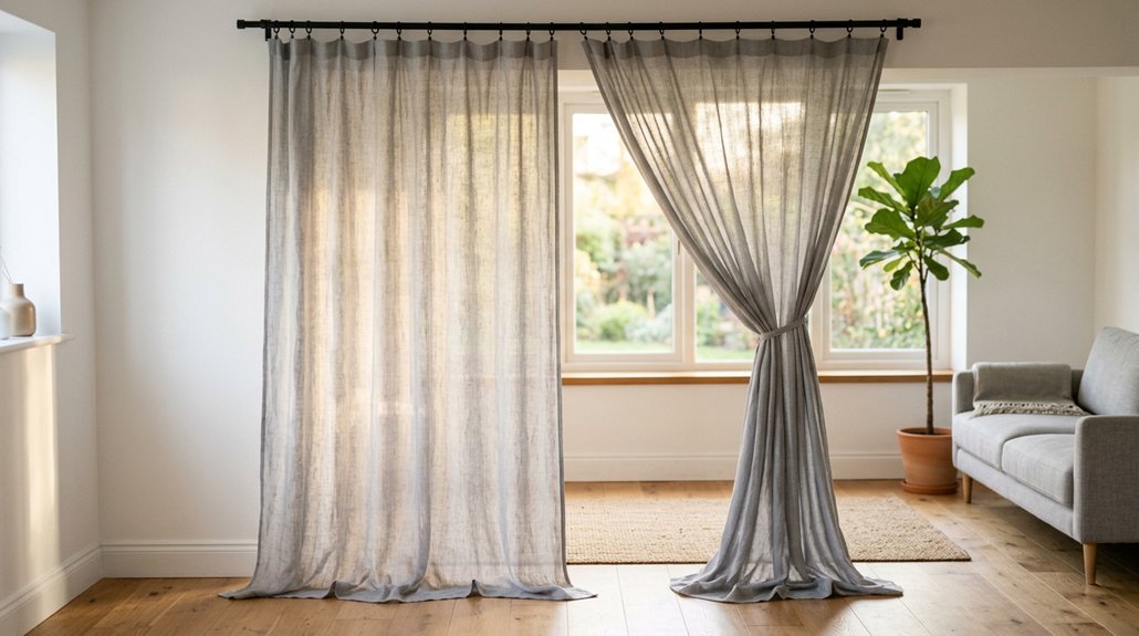


You stand before white walls like a painter before an empty stretch of prepared surface, and your curtain choice will make or break the room. Designers reach for ivory, soft greige, dusty blue, and sage green to add warmth without chaos.
You will want to keep white at 60%, curtains near 30%, and accessories at 10% for balance.
The right fabric weight matters too: linen filters light, velvet blocks drafts, and cotton blends clean easily.
Your wood tones and existing decor should guide the final pick, since navy pairs with walnut, cream suits oak, and charcoal anchors maple.
The ten colors ahead solve real problems, from small dark rooms to oversized sun-filled spaces, and you will find exact matches for your situation.
White Walls Look Sterile Without the Right Curtain Color
Although white walls feel clean and bright, they can leave a room feeling cold and unfinished when your curtains match too closely. You might think white-on-white creates harmony, but without contrast, your white walls look sterile and flat. Think of your space as a starting point for interior design, not a finished product. You need to layer in subtle difference to wake the room up.
Light and dark curtains both work, but you must choose with purpose. Pick a nearby shade like light gray, ivory, or light beige to add gentle depth without jarring contrast. If you crave energy, try dusty blue, sage green, or blush instead of harsh neons.
Remember the 60-30-10 rule: let white dominate at 60%, use curtains as your 30% anchor, and save 10% for small accessories.
Recommended Products
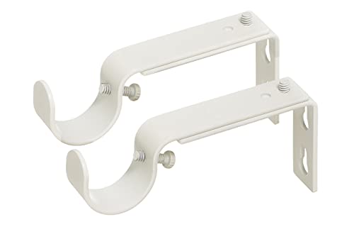
Ivilon adjustable bracket for curtain rods is compatible with any rod of 1 or 1 1/8 inch diameter rods. The only brackets finished with ivory/white coating of high quality....
Light or Dark? Choose Based on Room Size and Natural Light
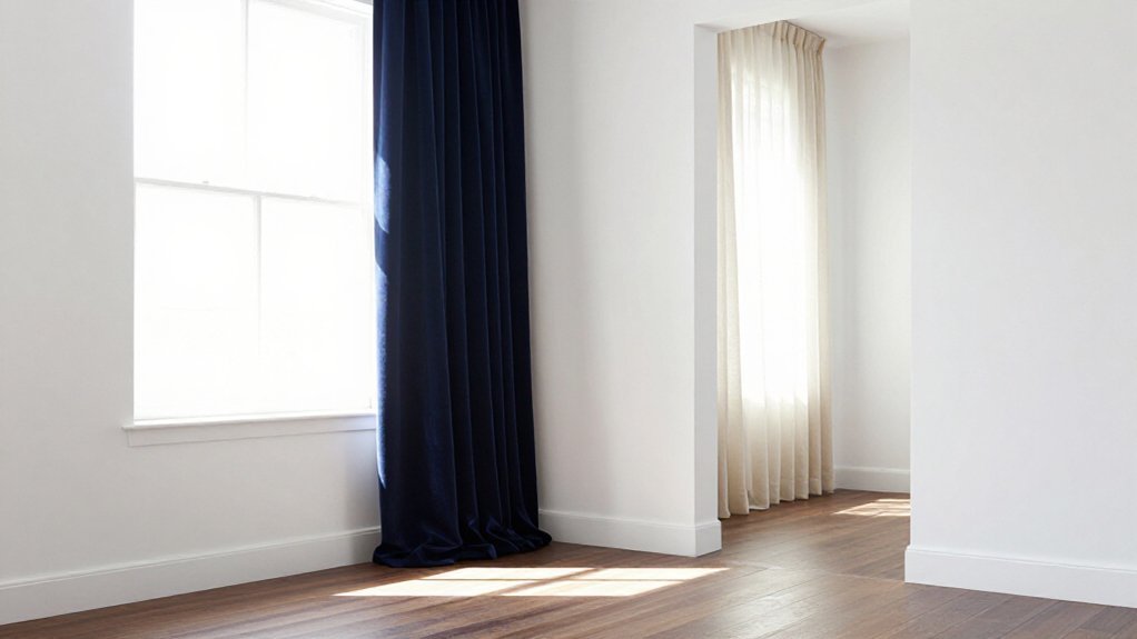
If you’ve got a small room with white walls, you’ll want lighter curtains, since they bounce light around and make the space feel bigger than it actually is. Brighter rooms with plenty of natural light give you more freedom, so you can experiment with charcoal or navy if you’re after a warmer, more upscale look. Dark curtains make a strong impression, but they’ll shrink a space fast if you don’t have enough daylight to balance them out.
Recommended Products

【Boho Patterned Design】Boho curtains are made from a linen-blend fabric that feels rustic yet stylish, detailed with embroidered stripes and handcrafted tassels. The...
Small Room Solutions
When you’re working with a small room and white walls, your curtain choice can make the space feel open or cramped. Light vs dark isn’t just about taste, it’s about square footage and sunlight. Choose Curtain Color wisely, and you’ll small room feel bigger without knocking down walls.
Picture your space with these options:
- Off-white panels that melt into the trim, blurring edges so the room seems to stretch.
- Dusty blue sheers filtering afternoon light, casting soft shadows that add depth without weight.
- Light gray linen pooling slightly at the floor, adding texture while keeping things bright.
- Ivory sateen catching window light, bouncing it back into corners that usually stay dim.
If your room gets limited sun, stick with cool-toned neutrals. They prevent washed-out walls while keeping the look airy.
Balance light curtains with texture variation, linen against sateen, so the space stays bright but never flat. Save charcoal or navy for larger, well-lit rooms; deeper shades make a space feel snug but shrink it visually.
Bright Space Benefits
In a bright room with white walls, you’ve got more freedom than most. Light curtains in ivory, off-white, or light gray make the space feel even bigger and airier, keeping that casual, open vibe you probably want.
If you go with white walls and plenty of sun, you can also handle dark curtains like charcoal or navy without shrinking the room. They add luxury and warmth, creating a comfortable, dramatic mood that lighter shades can’t match. Your choice should track the natural light you’ve got: lots of sun means dark shades feel rich and balanced, not heavy.
For drama without losing brightness, pick a desaturated bold like navy or sage rather than black. You’ll get controlled contrast that works with your white walls, not against them.
Dark Curtain Impact
With white walls, you’ve got a real choice to make, and it comes down to what your room can handle. Dark curtains, like charcoal or navy, bring luxury and warmth, but they absorb light. They work best in larger, well-lit spaces where brightness won’t suffer.
Your curtain shade level directly affects both perceived room size and room’s mood. Lighter tones feel airy, while darker ones create coziness and intimacy.
See this setup:
- Morning sun hits white walls, then meets heavy cocoa panels.
- Light flooring balances the visual weight below.
- A charcoal frame draws your eye toward the window.
- Navy fabric at dusk turns the space calm and enclosed.
If you crave that depth, pair dark curtains with ample natural light and lighter furnishings. Choose light gray or dusty blue to expand, or charcoal and cocoa brown to anchor.
Ivory Curtains for White Walls: The Foolproof Monochromatic Choice
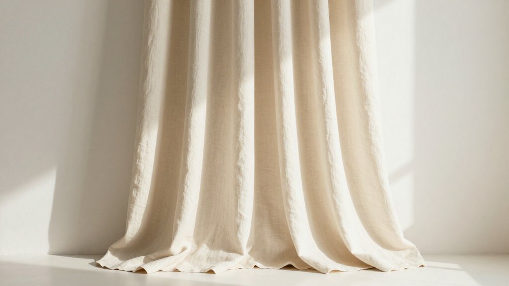
Ivory curtains offer you the safest bet when you’re aiming for a clean, pulled-together look without wrestling with color clashes. They give you a matching look that keeps things crisp, while bringing warmth so your white walls don’t feel washed out or flat.
Ivory curtains give you a clean, pulled-together look without wrestling with color clashes, keeping things crisp while adding warmth to white walls.
You’ll notice designers often use ivory as a quiet baseline. Let your walls take about 60% of the visual weight, then let your ivory curtains step in at roughly 30%. This gives you soft layering without harsh contrast.
You can go lighter or richer with ivory depending on your room. In smaller, dimmer spaces, pick brighter ivory for airiness.
For a more upscale feel, try linen, sheers, or sateen textures. Choose a shade slightly different from your wall so the eye catches depth, not a blank white block.
Recommended Products

Versatile Hanging Options: Set of 2 Panels. Each panel measures 52 inches wide by 84 inches long, with a back tab and loop pocket top design that provides three hanging options: an elegant pleated look from the back patch, a classic gathered effect with rod pocket style, or the ability to hang with clip rings (not included)

Basic Information: Includes 2 curtain panels, each measuring 50 inches wide for a total of 100 inches. Easy care for machine washable in cold water, do not bleach, tumble dry low, iron on low heat if needed.

WELL MADE: Sold as 2 panels, each panel is W52" x L84", and W104" x L84" in total. Each curtain panel has 2-in-1 top style design: rod pocket and back tab. With 3-inch inner diameter fit most standard rod. Curtains also can be hung with clip rings. 3 ways meet your various needs.
Beige and Cream Curtains: Warm Neutrals for Cozy Living Spaces
You’ll want to start by checking your room’s warm undertones, since beige and cream curtains work best when they share the same yellow, pink, or greige base as your walls and floors. For a comfortable layering technique, hang textured linen or layered sheers in light beige or ivory, which keeps the space bright while adding depth you can feel. This approach gives you a soft, warm base that pairs naturally with wood furniture, jute rugs, and other natural fibers.
Recommended Products

BLACKOUT BENEFITS: Enjoy optimal sleep with our Renzo window treatments. The off-white liner affixed to the back of the panels effectively blocks out most light, creating a darkened environment that promotes better sleep. In addition to their blackout benefits, these drapes also offer energy-saving and noise reducing properties.
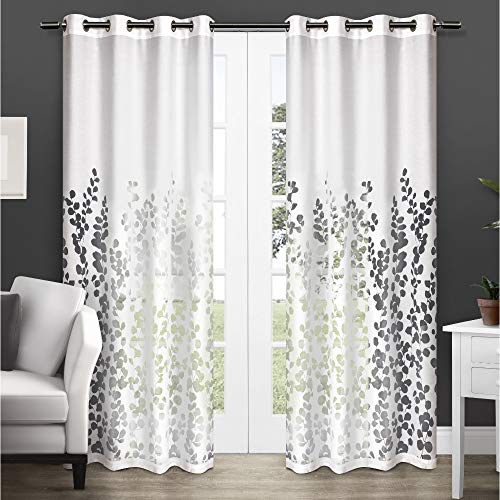
LEAFY FLORAL PATTERN: The Wilshire sheer curtain panels offer a beautiful leafy floral pattern that add elegance into any room.

Intricate geometric embroidery adds abstract style to any room of your home
Warm Undertone Harmony
Since white walls can sometimes feel cold or bare, adding beige or cream curtains brings instant warmth that makes a room feel lived-in and comfortable.
You can picture the effect clearly:
- Sunlight filters through cream linen, casting a soft glow against bright walls.
- Beige panels pool slightly on light wood floors, anchoring the space.
- Ivory weaves catch evening lamplight, deepening the room’s comfortable feel.
- Warm undertones echo across rugs and furniture, connecting everything together.
Designers rely on the 60-30-10 rule: keep 60% white walls, add 30% beige or cream curtains for depth. This curtain-walls contrast avoids sterile vibes. Choose textured fabrics, like linen slub, so warmth reads clearly.
Light beige and cream work universally, blending across decor styles without harsh edges.
Cozy Layering Technique
If you want a layered, warm look without clashing with white walls, beige and cream curtains are a reliable choice that keeps things simple.
You can master the layered technique by following the Rule of Three: keep about 60% white walls, up to 30% beige or cream curtains, and 10% small accents. This balance prevents your space from feeling washed out or flat.
When curtains go with white walls in warm neutrals, vary the shades slightly and mix textures like linen, slub, or sateen. For extra softness, layer beige curtains over lighter sheers to preserve openness while softening the look. Repeat ivory, cream, or beige in cushions or rugs to tie the palette together and make it feel intentional.
Light Gray Curtains: Modern Minimalism That Keeps Rooms Bright
Choose light gray curtains when you want a clean, modern look that won’t darken your white-walled room. They add more visual contrast than ivory or off-white, keeping your space bright and fresh. Designers favor light cool-toned grays for crisp, pared-back style, especially in small or dim rooms.
Light gray curtains deliver clean modern style without darkening your white walls, adding crisp contrast that keeps small spaces bright and fresh.
Picture this approach in your home:
- White walls cover about 60% of your visual space, keeping things open and airy.
- Light gray curtains fill roughly 30%, grounding the room without weight.
- Soft neutral accessories, about 10%, finish the look with subtle warmth.
- Varied textures, like linen slub or sateen, add depth so grey doesn’t fall flat.
Light gray pairs with warm light woods for calm airiness, or black accents for sharp, contemporary edge. You’ll get utility and style without complexity.
Recommended Products
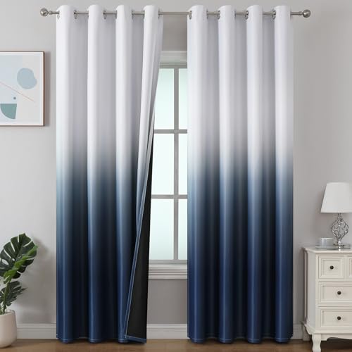
PACKAGE CONTENTS: Package includes 2 ombre blackout curtain panels. Each panel measures 52"W x 84"L and has 8 anti rust grommets, inner diameter of grommet is 1.6", fit well with standard or decorative curtain rods. Made of premium polyester fabric that feels soft.

COLOR AND DESIGN -- contrast colors pieced with each other and in pleated design, looks classic and elegant, great for use at home, dorm or hotel room; it provides you a feeling like bathing in a Spa
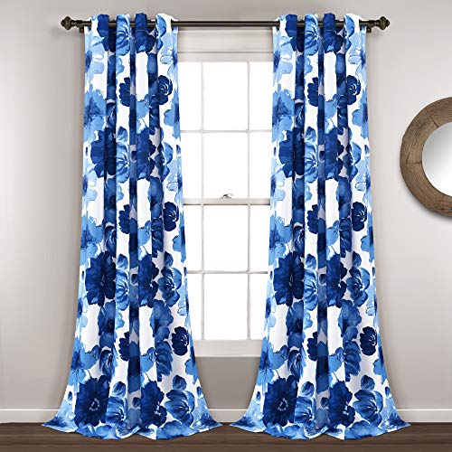
Bold Florals: The charming design of our Leah Light Filtering Curtains feature large, colorful blooming flowers that will brighten any room in your home with the feeling of spring. Add to your bedroom, dining room, home office or living room decor.
Dusty Blue and Blush Curtains: Soft Colors That Stay Polished
Light gray gives you a crisp, modern base, but you might want something softer and more welcoming. Dusty blue and blush wall and curtain colors deliver that gentle warmth without losing polish.
You can choose dusty blue curtains when you need a muted, desaturated pop that stays calm and restful. The gray undertones keep white rooms from feeling harsh or glare-prone.
Blush curtains bring soft warmth and gentle romantic color, but you must pick desaturated shades, not neon or brassy pinks. For balance, follow the 60-30-10 rule: let white dominate, give up to 30% to your dusty blue or blush curtains, and save 10% for accessories.
Add texture through linen, sateen, or subtle patterns so these light wall and curtain colors don’t wash out. Stick with cool, muted undertones, and balance with ivory, beige, or greige for a finished, designer look.
Recommended Products
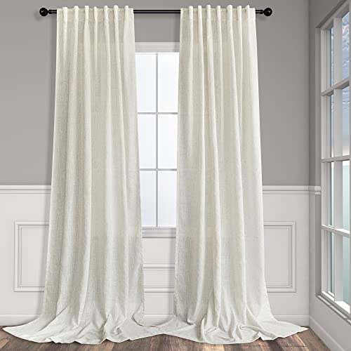
Basic Information: 2 LINEN PANELS in 1 package. Each panel measures width 52 x 84 length. 3-Way Hanging Options: Hang these curtain panels (1) using the back loops to create an elegant pleated effect, (2) from the 3 inch rod pocket for a classic look, or (3) using clip rings for easy, slide open and closed (clip rings are not included)

12FT Extra Long Backdrop Drapes: 2 Panels 5ftx12ft Ivory Backdrop Curtains for Parties. Totally 10FT(Width) x 12FT(Height). cortinas para fiestas decoracion.

Modern Design: 5/8 Curtain rod in rustic finish,simple yet modern look fits effortlessly with your place.Ideal as your kitchen curtain rods,bedroom curtain rods,sliding glass door curtain rods,outdoor patio curtain rods
Sage Green Curtains: Nature-Inspired Warmth for White Walls
When you want a color that feels like bringing the outdoors in, sage green curtains give you that natural warmth without shouting for attention. Their gray undertones keep things calm against white walls, so you get depth without harshness.
Sage works smarter than brighter greens because its muted quality won’t wash out your room. You’re getting a clear color statement that stays soft and livable.
Interior design trends for 2026 point to sage as a leading curtain choice, and designers favor it for modern, well-considered spaces.
Here’s how sage green curtains change your room:
- Morning light filters through them like leaves on a forest floor.
- They cast soft, earthy shadows across pale floors at dusk.
- Their fabric folds resemble stacked moss on quiet hillsides.
- They frame windows like living hedges against bright skies.
Keep sage dominant, let walls stay 60% of the room, and pair with light wood and warm textures for full effect.
Recommended Products

2 PANELS SET:Sold pair(set) of 100% blackout curtains, each window panels measuring 52 inches wide and 84 inches long with 8 grommets(1.6 inch inner diameter)
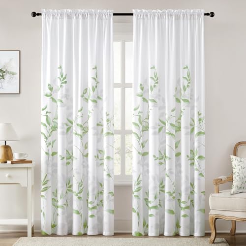
Package Includes: 2 Panels of Non-See-Through leaf floral printed semi-sheer curtains. Each panel measures 52"W x 84"L.

Hand-Painted Cottagecore Floral Design - Inspired by a spring meadow in full bloom, our botanical print features loosely arranged wild roses, scattered meadow flowers, and delicate butterflies in motion. The vintage hand-sketched background adds an heirloom-quality depth that brings the charm of an English country garden to your kitchen window.
Navy Curtains for White Walls: Classic Depth Without Harshness
Navy curtains give you that classic, tailored look without going too dark or stuffy. You get real contrast against white walls, and the blue keeps things calm and livable, not cold. Choose a mid-weight fabric in a true navy, around 8-12 ounces per yard, and you will hit the sweet spot between crisp style and everyday comfort.
Recommended Products

READY MADE:2 PANELS in 1 package.You can hang these casual curtains drapes with three methods: back tab, rod pocket, or curtain clips.Rod pocket top allows for a modern touch while back tabs add an elegant flair.It pair with blinds or sheers for extra opacity and privacy.

✅ EXACT RIGHT SIZE FOR YOUR WINDOWS - 1 Pair of 2 Standard Length 54" x 84" Dusty Blue (Slate) Sheer Curtains. Total Width - 108". 2 Voile Grommet Curtain Panels are Included In Each Package. 16 Grommets Total, Each Grommet Can Fit a Rod Up To 1.5 Inch in Diameter.

Fabric:Uniquely blended woven of 20% flax linen plus 80% polyester.Unlike primitive 100% linen fabric being too stiff and skin unfriendly,polyester helps on fabric soft,easy wash and wrinkle free but linens still keeping organic speck aesthetic from nature.
Classic Navy Appeal
Since you want a polished, grounded look without going too dark, navy curtains give you that deep contrast against white walls, but they stop short of the stark severity you’d get with black. In interior design, this pairing creates a lively, high-contrast look that avoids the harsher black-on-white feel many homeowners fear.
Navy curtains add dramatic depth, and they make white-walled rooms feel warm, not sterile. Their deep blue tone grounds your space while keeping things polished.
For best results, picture this balance in your home:
- Warm wood floors glowing against the cool blue fabric
- Brass lamp light bouncing off ivory sheers layered behind
- A cream sofa anchoring the room’s center
- Terracotta throw pillows tying into navy’s complementary warmth
Choose lighter navy in smaller, dimmer rooms, and deeper navy in bright, spacious ones.
Balanced Contrast Technique
You’ve already seen how navy curtains bring that grounded, polished feel to white walls, but pulling off the look takes a bit of planning. The balanced contrast technique keeps things sharp without going too dark. Start with the 60-30-10 rule: let your white walls and neutral base take about 60%, add navy curtains for up to 30% of bold contrast, then finish with 10% accents in off-white, brass, or natural wood.
Pick a deeper shade level so the navy adds real depth, and keep surrounding areas bright so the room stays luminous. Pair navy with light gray or soft greige in pillows and rugs so it reads as intentional, not jarring.
Use this approach in spaces with enough natural light, or lighter flooring, to balance the darker tone while keeping that classic depth you want.
Styling Tips Guide
When you’re dressing white walls with navy curtains, you’ll want to keep a few practical rules in mind so the room feels finished, not crowded.
Pick the right curtain by following the 60-30-10 rule: keep about 60% of your room in light neutrals like white walls, use roughly 30% for bold navy drapes, and save 10% for small accents such as navy pillows or brass hardware. This balance prevents the space from feeling overwhelmed.
For a lighter, brighter effect, choose navy in a linen-like weight rather than heavy velvet. You’ll maintain airflow and openness. Pair your navy with plenty of natural light and pale flooring so the contrast feels rich, not gloomy.
- See sunlight filtering through lightweight navy panels, casting soft blue shadows across white plaster.
- Notice matte navy weave catching morning light, its subtle ridges creating gentle depth against smooth walls.
- Watch cream floors reflecting upward, balancing dark drapes so the room feels warm, not cavernous.
- Observe sateen navy fabric shimmering faintly, adding quiet richness without competing for attention.
Build texture contrast through matte weaves, sateen finishes, or understated patterns so your navy reads rich and intentional against crisp white.
Charcoal Curtains: Edgy Contrast for Large, Well-Lit Rooms
If you’re looking to add drama without overwhelming your space, charcoal curtains strike a smart balance against white walls. Charcoal delivers strong, edgy contrast while staying grounded. Dark curtains like these work best in larger, well-lit rooms, since their deeper shade can visually shrink or darken smaller spaces. You’ll want plenty of natural light to keep things feeling open.
For a contemporary look, pair your charcoal drapes with matte black fixtures or leather accents. This amplifies the moody, modern effect without fighting your white walls. If you’re worried about heaviness, keep the rest of your palette light: white or cream bedding, light flooring, and ample windows balance charcoal’s weight.
In styling, charcoal can act as the bold 30% element in a 60-30-10 color ratio scheme. Your white walls stay bright at 60%, while accessories and textures fill the remaining 10% to soften the overall contrast.
Recommended Products
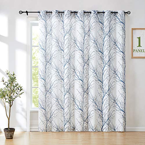
WINDOW CURTAIN: 1 Panel, 100" w x 96" /panel, Blue grey branch on white curtain. Recommend ordering 2 to 3 times rod width for proper look and fullness
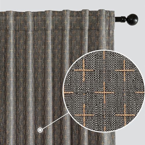
WELL MADE:Sold as pair.Each panel measures 52"W x 84"L.Each curtain panel has 2-in-1 top style design:rod pocket and back tab.With 3-inch inner diameter fit most standard rod.Curtains also can be hung with clip rings.3 ways meet your various needs.

Structured & Polished Look: Holds its shape beautifully for a clean, tailored window finish—ideal for those who prefer a more refined look over a relaxed, floppy drape.
Match Your Final Choice to Wood Furniture and Existing Decor
Wood furniture and existing decor should guide your final curtain choice, since the wrong pairing can make a room feel disjointed even with perfect wall color. With light wood furniture, you’ll want beige, cream, sage, or dusty blue curtains to keep things warm and naturally cohesive. For dark wood furniture, gray, navy, or charcoal curtains create contrast against white walls without looking washed out.
When matching to existing decor, aim for this 60-30-10 balance:
- Let your white walls and large neutrals dominate at 60 percent.
- Use your curtain color choices as the main accent, up to 30 percent.
- Keep accessories small at 10 percent.
- Pull a similar tone from patterned upholstery into your curtains so they stand out while staying coordinated.
For mixed decor, lean on neutral shades like ivory or soft greige, and vary texture to prevent flatness.
Recommended Products

COLOR BLOCKED DESIGN: Featuring gradient colored wide stripes design, these Chateau curtain panels will make a bold statement in any room.
COLOR BLOCKED DESIGN: Featuring gradient colored wide stripes design, these Chateau curtain panels will make a bold statement in any room.

Package and Size: Each package contains 2 voile curtains. Each curtain panel measures 59" wide by 120" long. Total width is 118" and total length is 121.5" (Contains 1.5" header). Extra wide curtains hang in the window for added beauty and elegance

I've spent years obsessing over the details that make a house feel like a home — from the perfect bedding layers to a thoughtfully styled coffee corner. My focus is on modern, aesthetic home decor ideas that are beautiful, trend-aware, and actually achievable. Great style shouldn't require a big budget — just the right inspiration.
Follow on Facebook