
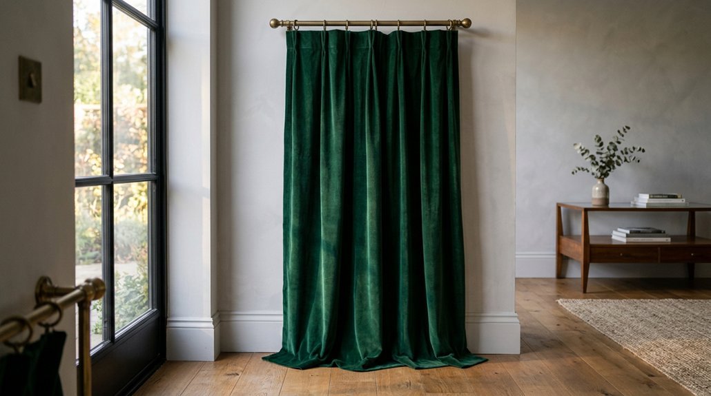


You’ve got grey walls, and now you need curtains that actually work.
The right choice depends on your room’s light, your furniture, and how much contrast you want.
Grey seems simple, but pair it wrong and your space feels flat or jarring.
Get it right, and the room clicks together.
That’s where these seven color options come in.
White Curtains for a Fresh, Gallery-Like Contrast
White curtains give grey walls a clean, gallery-like look that opens up your space and keeps things feeling fresh. When you choose White Curtains for grey walls, you create a crisp contrast that makes rooms feel brighter and more pulled together.
You’ll want to pick curtains at least two shades lighter than your grey wall color for the most flattering effect. Sheer white styles filter light beautifully in sunny kitchens or living rooms, while opaque fabrics give you the privacy you need in bedrooms. Pure white maximizes light reflection, though warm white softens the overall feel if you prefer something less stark.
Choose simple solid white in structured fabrics like linen to add definition without clutter. This prevents a flat, washed-out look while keeping your Curtains for Grey practical and polished.
Recommended Products

Sold as 2 Panels: Each pack contains 2 voile sheer curtains, each 40" wide and 84" long, total width is 80". The top 2" rod pocket makes curtains easier to hang or slide, suitable for curtain rods of most windows. 1.5" curtain header makes a nice decoration for your window.

SOLD AS 2 PANELS: Each package includes sheer curtains 84 inch length 2 panels set; Each panel measures 42" width, gray sheer curtain width is 1.5-2 times wider than your window to form a nice look.

30-Day M oney-B ack, HIGH-GRADE 100% Polyester Sheer Voile Fabric.
Cream and Ivory Curtains for Soft Warmth Without Starkness
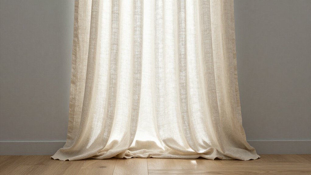
You can use cream and ivory curtains to build gentle tone-on-tone layers against your grey walls, keeping things soft without the sharp snap of bright white. These warm neutrals pull out the welcoming undertones in cool grey, so your room feels balanced rather than cold or flat.
You’ll get the most from this pairing when you stick to fabrics that sit a couple shades apart, letting the colors harmonize without melting into one muddy wash.
Recommended Products

Distressed Design:Jacquard woven of colored yarn on greyish white fabric to create a color block two tone contrast,these drapes surely add depth and sophistication to your room.Especially well compliment your similar distressed area rugs and pillow covers.

Ready Made: Package includes 2 linen curtain panels, each measuring 50"W & 84"L (100"W for pair). The linen curtains are crafted from open weave linen blend fabric and primitively natural effect make the curtain panels more drapery and aesthetic

Versatile Hanging Options: Set of 2 Panels.Each panel measures 42 inches wide by 63 inches long, with a back tab and loop pocket top design that provides three hanging options: an elegant pleated look from the back patch, a classic gathered effect with rod pocket style, or the ability to hang with clip rings (not included).
Tone-on-Tone Layering
Against cool grey walls, cream and ivory curtains build warmth without the harsh edge of pure white, giving you a layered look that feels modern yet easy to settle into. When you choose Curtains Go with Gray in these tones, you create depth through subtle variation rather than bold contrast.
For true tone-on-tone success, you’ll want to pick Curtains for Gray that sit one or two shades lighter or deeper than your wall color. Linen curtains excel here, their natural weave catching light differently than flat paint and helping the eye read each layer as distinct.
You can also mix sheer cream panels with solid ivory drapes, brightening dim rooms while adding privacy. This warm-neutral pairing keeps your space comfortable, pleasant, and livable through every season.
Warm Undertone Harmony
Because grey walls can feel cold or flat on their own, cream and ivory curtains add the warm pigments you’re missing. You’ll get a softer, more lived-in look without the harshness of pure white.
Pick cream and ivory curtains that differ slightly from your wall shade, or choose textured linen, so the room doesn’t read flat from an exact match. Warm white options like cream reflect light well, helping you brighten north-facing rooms while keeping contrast gentler than stark white.
For a low-risk effect, pair these warm curtains with warm-gray walls, or any grey that leans beige or taupe, since the undertones align visually. Linen or other softly textured fabrics in cream and ivory add depth, preventing the “all-same-color” monotony that smooth, tonal matches create.
Blush Pink Curtains for Quiet Femininity on Cool Gray
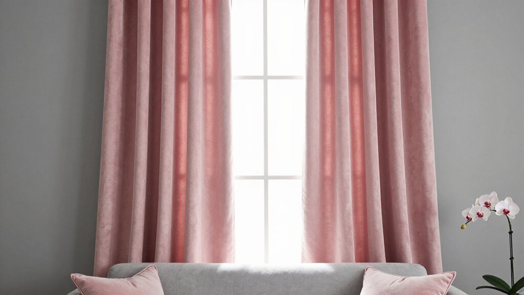
When you want to soften a cool gray bedroom without making it feel too sweet, muted blush pink curtains offer a quiet solution that reads grown-up rather than girlish. Among curtain colors for grey walls, blush pink stands out because gray naturally tones down pink’s sweetness, giving you a mature, calm, put-together space.
You’ll get the best results with dusty, rose-pink tones instead of bright bubblegum, which fights the wall. Pick a cool-toned blush with a slightly grayish cast for that restful effect you want. Sheer or lightweight linen keeps things airy and soft, letting natural light wash gently over the gray.
Pair your blush curtains with ivory bedding, light wood, or warm white trims, so the pink stays a subtle accent without shouting.
Recommended Products

380GSM Thick Linen Blend – Woven from premium linen, cotton, and polyester for an authentic, natural texture. The heavy-duty fabric creates elegant, modern folds while enhancing light control and thermal insulation. Perfect for living room, dining room, bedroom, office, nursery & more.

BLACKOUT BENEFITS: Enjoy optimal sleep with our Renzo window treatments. The off-white liner affixed to the back of the panels effectively blocks out most light, creating a darkened environment that promotes better sleep. In addition to their blackout benefits, these drapes also offer energy-saving and noise reducing properties.

Elegant Design: Lino Rosa curtains feature a minimal boho floral striped print,adding a touch of elegance and sophistication to any space.Complenting a wide range of interior styles such as bohemian,farmhouse,country and modern contemporary.
Mustard and Terracotta Curtains for Inviting Earthy Character
If your grey walls feel a little too cold or flat, mustard and terracotta curtains can add the warmth you’re missing without clashing with the neutral base. Mustard yellow curtains bring energy when you pick muted shades, not bright yellow-gold, creating a refined warm pop against cool-toned greys. Terracotta curtains in rust, burnt orange, or clay-orange deliver desert-inspired warmth, pairing best with warm grey walls and natural textures like wood.
Both colors carry warm earthy tones that counteract grey’s sterile edge. For balance, choose curtains about two shades lighter or darker than your wall so the color shows clearly without overwhelming the space.
To add depth, pick textured fabrics. Heavyweight Linen works beautifully, giving the warm earthy tones dimension and a relaxed, lived-in feel against your grey backdrop.
Recommended Products

100% Blackout Curtains: Our Blackout Curtains ensure a completely dark room, isolate noise and protect privacy. These room darkening curtains can block 100% sunlight.Heavy duty curtains keep heat indoors in winter and discharge heat in summer, thereby reducing cooling and heating costs , While protecting your furniture, floors and artwork from the sun damage

Structured & Polished Look: Holds its shape beautifully for a clean, tailored window finish—ideal for those who prefer a more refined look over a relaxed, floppy drape.

Soft Fabric and Size: Each curtain panel measures 42 inches wide by 54 inches long. The soft, substantial fabric falls into natural folds, giving bedroom and living room windows a neat, finished look
Navy Blue Curtains for Classic Depth and Polished Elegance
Navy blue curtains give your grey walls a classic, polished look that feels both dignified and enduring. You create clear contrast when you pair Navy Blue with light or medium grey, and the result feels moody, sumptuous, and hotel-like without overwhelming your space.
For extra richness, choose navy velvet, since darker, lustrous fabrics read especially opulent against grey. You should use lighter navy on darker grey walls, and deeper navy on paler grey walls, to keep the color relationship balanced.
If you add navy as the accent, keep the rest of your modern room lighter. Brighter furniture, rugs, or wall art prevent the darker panels from feeling heavy. Unlike grey curtains, which blend in, Navy Blue defines your windows with bold, intentional style.
Recommended Products

Durable Fabric: Each curtain panel is made of sturdy faux linen fabric, which is winkle free and tear resistant. The professional sewing craftsmanship makes these voile drapes soft and comfortable.

Fabric:Uniquely blended woven of 20% flax linen plus 80% polyester.Unlike primitive 100% linen fabric being too stiff and skin unfriendly,polyester helps on fabric soft,easy wash and wrinkle free but linens still keeping organic speck aesthetic from nature.

Durable Fabric: Each curtain panel is made of sturdy faux linen fabric, which is winkle free and tear resistant. The professional sewing craftsmanship makes these voile drapes soft and comfortable.
Charcoal Curtains for Moody, Layered Sophistication
You’ll want to pick charcoal curtains that sit at least 2, 3 shades darker than your grey walls, so the window gains real weight without disappearing into the paint. A heavier fabric like velvet or chenille keeps the look from turning flat, since the weave catches light and builds subtle depth.
Pair those dark panels with lighter trim, rugs, or art, and you’ll lock in a moody, layered feel that still breathes.
Recommended Products

Sold as 2 Panels: Each package includes 2 pieces light filtering sheer curtains. Each panel measures 38 inch in width and 84 inch in length(not include top 1.5 inch header), the total width is 76 inches. Dual Rod Pocket Design to show a nice look. Multiple sizes are available, please measure your window before you order to select the right length

READY MADE: 2 panels sheer curtains per package. Each panel is 54" wide and 84" long when hanging as a flat. One of the grommets' inner diameter is 1.6". Purchase curtain whose width is 1.5-2 times wider than your window will form a nice look.

Package Includes: 2 Panels of Non-See-Through grey and white leaf floral printed semi-sheer curtains. Each panel measures 52"W x 84"L.
Shade Difference Essentials
When you’re working with grey walls, charcoal curtains can add real depth, but only if you get the shade difference right. You need to choose charcoal curtains that are at least 2, 3 shades darker than your grey walls. This gap ensures clear contrast, so the panels read as intentional layers rather than a muddy, blended wash.
For the richest effect, you’ll see charcoal work best against light or medium grey walls. The deeper tone pops, and the moody feel comes through without confusion. Pair charcoal with warm neutrals like cream, beige, or light wood to keep things grounded.
Balance darker panels with lighter furniture, rugs, or art, especially in smaller rooms, so the space stays open and refined.
Texture Prevents Flatness
Texture keeps charcoal curtains from falling flat against grey walls. When your curtain tone sits just 2–3 shades below your wall color, you’ll need texture to create visual separation. Smooth fabrics can make charcoal and grey blend into one dull plane, so you’re better off choosing velvet, chenille, or a matte linen blend. These materials catch light differently, giving your curtains real dimension without adding clutter.
For a monochromatic grey scheme, you’ll want to layer textures deliberately. Try pairing charcoal velvet panels with lighter grey linen sheers, since this combo separates the tones even when they’re close in value.
If you go darker with your charcoal, balance the weight using wood furniture, metallic lamps, or mirrors. These reflective elements keep the room from feeling too heavy, and they add warmth that plain grey can’t provide on its own.
Moody Layered Effect
Because charcoal sits several shades below most grey walls, it creates a moody, layered look that feels intentional rather than flat. You achieve this layered look by choosing charcoal curtains that sit at least 2 to 3 tones darker than your wall color.
You deepen the effect further when you pick textured fabrics, such as chenille or velvet, which add visual weight and keep the monochrome scheme from feeling dull. Charcoal curtains work especially well against light or medium greys, where they ground the space without overwhelming it.
You should balance charcoal’s depth with lighter pieces nearby: pale rugs, cream upholstery, or brighter artwork. This prevents the room from feeling too heavy. Richer finishes, like velvet or heavy linen, give you jewel-like depth and tactile interest that plain fabric cannot match.
Black Curtains for Bold, Contemporary Drama
If you want a bold, modern statement, black curtains deliver the sharpest contrast against light gray walls. They anchor a modern room with crisp definition, and you can keep the look balanced without overwhelming your space.
- Pair black curtains with lighter furniture, rugs, or wall art so your room doesn’t feel too heavy or closed in.
- Choose black blackout curtains for home offices or media rooms, since they block sunlight while keeping style clean.
- Pick velvet or chenille textures to stop black from looking flat against gray, adding visual depth you can actually see and feel.
- Use charcoal instead of pure black if your walls run darker, maintaining contrast without crushing the room’s balance.
Recommended Products

Versatile Hanging Options: Set of 2 Panels.Each panel measures 52 inches wide by 84 inches long, with a back tab and loop pocket top design that provides three hanging options: an elegant pleated look from the back patch, a classic gathered effect with rod pocket style, or the ability to hang with clip rings (not included).

Well knitted tiebacks, suitable for medium thick, living room, outdoor curtains. Not suitable for sheer, thin or light curtains.

Unique Ombre Blackout Curtain: is sewn with 180gsm blackout white liner make the drapes thick enough to blackout sunlight and UV ray. This can provide absolute privacy, heat insulation and noise reduction. Premium Texture fabric retails more than double.

I've spent years obsessing over the details that make a house feel like a home — from the perfect bedding layers to a thoughtfully styled coffee corner. My focus is on modern, aesthetic home decor ideas that are beautiful, trend-aware, and actually achievable. Great style shouldn't require a big budget — just the right inspiration.
Follow on Facebook